mixed media: baby steps

Hello!

So its been a ridiculously long while. I was first away on holidays, then stuck in some sticky work situations, and honestly the time i did get I crafted my heart away but sadly never got to blogging about any of them. Im back with a plan to be more regular now that things are well settled at home and at work Alhumdolillah 🙂

By the way, I have been keeping on my toes on my instagram account all this time, just in case youd like a see! 🙂 zee_crafts

_________________________________________________________________

So today Im sharing something Ive been planning to try my hand at forever; Ive been rather obsessed with mixed media, but from afar. Finnabair ArtFiles on YouTube have been the cause of many a sleepless nights. Well, sleepless as I cant stop watching as the magic unfolds. Serious therapy!

To embark on my own mixed-media journey I wanted to work on journals/notebooks. They are an old obsession of mine. So I had three plain kraft journals sitting around begging for some mixed media loving. And so, I present to you my attempt at mixed media layouts!

Baby steps, remember! ❤ Lots to learn through experimenting and making more and better attempts, but this is how my first set looks: zee1

These are A5 journals. I used a variety of wooden embellishments, flowers by Petaloo and some unbranded variety too. Stencils used in both texture paste [far right], as well as with acrylic gold paint [far left] and finally as a background with texture paste that was then treated with FaberCastell gelatos. A few metal embellies here and there and some beads and.or bling.

I loved how they turned out though I know I have a long way to go.

Some closeups!

I hope youll drop by with your thoughts and feedback! ❤

I promise to be more regular with my posts too


Cardmaking: a pretty effective stress reliever :)

I’ve got tons happening at work and a lots of stress that comes with it. So tossing and turning while trying to get some sleep wasn’t going to stand a chance against being in the craft room instead. 
A quick card that I have put together using Kaisercraft products and would like enter into December’s challenge at the Kaisercraft blog. 


Kaisercraft products used:

Paper: Telegraph Road 6.5×6.5″ 

Foiled butterflies fussycut from All that glitters specialty 12×12 sheet

Wooden frame in roses
 

just a touch of silver

20151130_212356

I made a card after a week of loud and big projects. An A2 sized card layout sounded like a good idea compared to the 6 feet buntings, and A1 size posters I just delivered a few days ago. As fun as those projects are sometimes, theres a comfort like no other in good old card making.

So I made a card for the Altenew monthly challenge. 

The card is very simple and straightforward but it did take the good part of my morning to complete. All thanks to my need to upgrade a stamped image to something more than the ink stamped image it produces. today I added broken lines to the outlines of the leaves and drew veins onto them too. This keeps it subtle, but looking at it from different angles allows a fun new dimension to the images. The sentiment is on a vellum banner, attached to a burlap base. The glassy bead attached to the side is a fun way to finish the card off on a more formal note, and also to hide the glue dot beneath 😉

Here it is, along with a picture used as inspiration:

Altenew Supplies used:

three of the leaf stamps from the Lacy Scrolls set http://altenew.com/collections/stamps/products/lacy-scrolls

and the sentiment is from the Sentiments and Quotes set. http://altenew.com/collections/stamps/products/sentiments-quotes I absolutely love how well they stamp/emboss.

The apricot and blue inks used are from Simon Says Stamp and the red is my firebrick distress ink pad.

The burlap strips have been cut from burlap card blanks by dcwv.

Loved making the vellum envelope for this card. Reminded me of the wedding invite my mum designed for my brother’s wedding reception nearly 14 years ago. 🙂

shake it!

I loved this challenge by Stamping Smiles Designs.

http://stampingsmilesdesigns.blogspot.com/2015/10/tic-tac-toe-challenge-design-team-call.html

the Tic Tac Toe was hard to choose from:

Design Team Call Challenge Badge Red

I eventually selected the far right down line for a shaker card: Thank You Card + Sparkles + Woodgrain

The woodgrain in my 5.5×6″ card comes from a printed sheet from the DCWV Gilded Paper stack. The Sparkles comes from the many sequins in the shaker and the Thank You is a diecut that i recently received in a craft swap ❤ Passing on the kindness

This is my very first shaker card attempt and Id like to send it to someone Ive known for 23 years as one of the most determined and hardworking teacher I have ever had the good fortune of knowing. She taught me when I was in School and we now work together at the same School and I am luckier everyday to be able to learn from her. 🙂 She is one of the kindest souls you’d ever meet! And so, Id also like to enter this one to the kindness campaign by Jennifer Mcguire Week 2 http://www.jennifermcguireink.com/2015/11/share-handmade-kindness-challenge-week-2-community.html

IMG_0437

IMG_0439 IMG_0440

Okay so I have wanted to achieve a shadow image for a while. [In my head Ive made a hundred and one shaker cards ;)] The shadow was imminent with the height on this shaker. 2 foam layers and 2 paper layers.

IMG_0438

heres one in different lighting. just because this card enjoyed the posing 😀

FullSizeRender (4)

I hope you like!

Custom Print Backgrounds- Step by Step

Hello there! How’s it going? Ive been on a cardmaking spree and have absolutely loved every bit! Working mostly on simple cards that have fun backgrounds and then not much else.

Usually I like the random stamped image here and there, but working with a small stamp the other day, I made a background with a much more coordinated pattern in my head. Link here: https://zeecrafts.wordpress.com/2015/10/27/ikat-inspired-backgrounds/

I so liked the result that I thought Id have another go at it with another stamp set.

This is the card I made last night and I thought Id share a quick step-by-step for it.

photo 3 (13)

Supplies:

  • a 220gm thick white card
  • Card Base: Top folding. Measures 4.25 x 6.5″ when folded
  • Card Front: 4.25×6.5″
  • Small white sheet for the sentiment and fussy cut butterflies to be cut from. Same card material
  • Acrylic Paint in silver. A brush and some water too.
  • Inkpads. I used: Mint by Simon Says Stamp, Seedless Preserves Distress Inkpad, Mustard Seed Distress Inkpad
  • Silver Embossing powder and heat embossing supplies
  • Stamp Set with small individual images. I used a this set by Teresa Collins

ys1014

Step wise Instructions:

Start off by drawing very light grid lines on your card front. Make sure they are light [need to be erased after the stamping is done]. I like keeping my cutting  mat as a guide. No hard and fast rule on how close these need to be. You just need some sort of a guide on placement and this grid does that for you.

 photo 1 (18)

Next, choose you colors. I chose for my largest butterfly to be in purple as its the color I wanted to stand out most. photo 2 (20)

Keep a scratch paper on the side to quickly stamp samples and see how they look together when done on paper.Quick swatch to see how they go together:photo 3 (14)

And now, lets begin! Stamp your first image on a place on the grid where you think you can remember the center from. Butterflies are easy as they have their clear center points. My apologies, I remembered taking a picture well into my process.  photo 4 (8)

Once I had stamped all over the page I was good to use an eraser to remove the grid lines [and if you look closely, I made a mistake in the second column that I had to pay for in the third. but I guess it only bothers the oddballs like myself. No one in my family knew what I was on about, so its okay ;)]

Now I wanted the card to have some depth. So I stamped a butterfly each in all three colors and fussy cut them out.

photo 5 (2)

Now for the silver splashes

So I didn’t take a picture of this part in-process mostly because both hands were otherwise occupied. But heres what I did: I took some acrylic silver paint, added a few drops of water to change consistency to a shakeable form, took a paintbrush, placed the card on my newspaper covered floor and had a go at some angry splashes here and there. 🙂
photo 1 (17)

The Congratulations sentiment was heat embossed in Platinum Silver and cut banner style. This was added on with some foam adhesive while the butterflies added to their coordinating images on the base. Just a bit raised from their wings. This piece was simply adhered onto the card base and voila!

So thats it! Custom made background prints. 🙂

Id be happy to help out if you have any questions

photo 2 (19)

Id like to enter this card into the following challenges:

  1. http://www.simonsaysstampblog.com/wednesdaychallenge/simon-says-anything-goes-20/
  2. http://www.simonsaysstampblog.com/mondaychallenge/?p=3130 and for this, Im throwing back to this very fun challenge from September 2014: http://www.simonsaysstampblog.com/mondaychallenge/?p=1920

Bokeh love

[Long Post. be forewarned!]

So I definitely wont be the first or last to this bokeh-effect inked backgrounds party, but I cant resist joining in the fun. After watching tutorials on youtube by HeroArts, the very awesome Yana Smakula and others, I thought Id give it a go.

As I experimented, I realized there are SO many ways the bokeh effect can be played around with. I’m sharing the 4 I got done with last night and some instructions on how to go about making them.

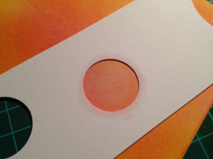
The first is done following instructions by Yana from her youtube channel [her blogpost on bokeh effect backgrounds: http://www.yanasmakula.com/?p=45080]

Heres mine:

IMG_0112

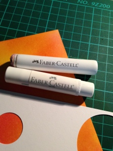
I love how the stamped circles interact with each other. My version works with a diy stencil instead of a stamp set and with dye inks instead of the pigment inks. I do have one Colorbox Silver pigment ink and that came in useful. The transluscent cream-white circles are done using a Faber-Castell gelato stick.

The dye inks used here are my brand new pads from Simon Says Stamp. I LOVE these inks. Have used Stone, Mint, and Steel Blue.

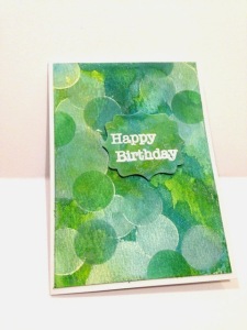
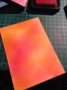
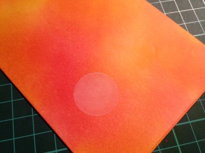
The next was a style im most comfortable with- a distress ink-blended background in 2,3 colors and the bokeh-ing done on top of that.

IMG_0114

I LOVE the subtle bokeh and the bright happy colors here. The areas looking pink here are a lot more coral when seen live.

I did think of adding a few white sequins to finish this off, but I then chose to keep this as it is.

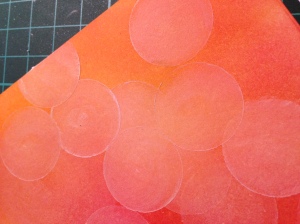
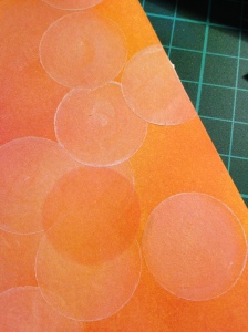
Final look was a bit of a lets-see-how-this-develops kind of a card base that I actually really liked seeing coming together. It started with distress ink smooshing [step by step pictures below] and once I was happy with the background I then did the bokeh stenciling in the same colors and in white on selected areas. The undone area became room for a simple diecut and heat embossed sentiment. I quite like how it looks now. What do you say?

IMG_0110

And now for the instructional part. I don’t know if I’ll be able to do justice but here goes:

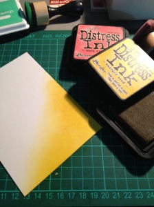
I’ll be showing you the steps for this ink-blended one
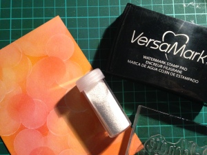
IMG_0114

Supplies:

  1. 220gm thick white card
    1. Card Base: Top folding. Measures 4.25 x 6.5″ when folded
    2. Card Front: 4.25×6.5″
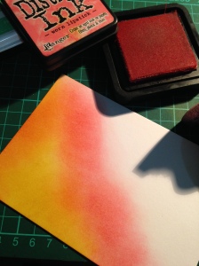
  2. Distress Inks. I used Worn Lipstick and Mustard Seed.
  3. Faber Castell gelato in white and the stick dauber that comes with their kit
  4. White Embossing Powder and Heat Embossing supplies
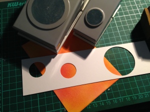
  5. A circle stencil. I made my own.

Instructions:

Start by taping on your card front to your space. I use a repositionable double sided tape. Keep your ink-blending tools ready. Always fun to have more than one. I initially wanted to add a bit of mint, but later decided not to.

IMG_0076

Now, in quick circular motion begin the blending from one corner. I tend to go in diagnol sections. I usually ink up 3 or for areas first and then blend the remaining. Here however, I went from the bottom to the top in one go.

IMG_0077

IMG_0078

IMG_0079

Now for the bokeh bit.

I make my own stencil using heavy cardstock and punching out 1″ and 2″ circles.

IMG_0080

so very simply, ill be smooshing some of the white gelato onto my background through the stencil.

IMG_0081

Like this:

IMG_0082

and then blending it in with the dauber. one finger tip works just as well. circular movements.

IMG_0083

and here’s how it looks!

IMG_0084

continue with this until you are happy. Vary between the 2″ and 1″ circles. I tend to keep the larger circle on the corners and the smaller ones scattered throughout.

IMG_0085

IMG_0086

Also for variation in the colors, I like going in with the inks and making some of the circles in the inks used. This allows for some layered play and makes it even more bokeh-ish. 🙂

IMG_0087

IMG_0088

IMG_0089

Now, the colors will fade a little as they dry but not too much depending on the card stock used.

I then heat emboss a sentiment on

IMG_0090

IMG_0091

Now, as you probably know, both the gelato and distress inks are water-based pigments. So a water related accident could ruin this card front. I like to spray on a layer of lacquer. It also finishes it off rather well with a near picture-printed look.

IMG_0092

I wanted to keep the background the focus of this card and so have left it plain, but you could always add some sequins to dress it up.

Hope you like the process and that you have a go at this yourself too. Enjoy. 🙂

Happy Crafting xx

Challenge Entry Sketch 251- My Favorite Things [Part 2]

I was having so much fun making cards with the sketch that I thought Id have another go! Here it is!

IMG_8414

The background is ink blended with distress inks [seedless preserves, broken china] with a bokeh effect [separate post on that soon!] and to this I added some stamping with my favorite background stamp by MFT- [the Romantic Script].

Two fancy flourish diecuts have been sprayed silver and glued on to make an impression of the side circular panel from the original sketch. The dimensional flower is made with MFT dienamics as well.

MFT Supplies:

Heres the best part though, those enamel dots are handmade by my friend! Arent they the best!? Have a look here, she has shared the whole process and somehow made it look so easy: http://www.thecreativeelementblog.com/2015/10/26/enamel-goodness/

Id like to make this my second entry to the Sketch Challenge, Sketch 251 http://www.cardchallenges.com/search/label/sketchchallenge

Hope you like! Do let me know if you do 😉

Challenge Entry Sketch 251- My Favorite Things [Part 1]

Ive never been able to make an entry to any sketch challenge till now. Somehow the pressure of following a sketch and yet being creative has been so much that i overthink my layouts a million times and by the time I’m done my head [and workspace] is a massive mess! hah.

But I’m turning a new leaf now and so Im just going to go for it! And Ive been a big fan of My Favorite Things. http://www.cardchallenges.com/search/label/sketchchallenge

Heres the sketch for this week:

251

I made two cards with this. Here is my first go:

IMG_8410

IMG_8412

Please excuse my far from satisfactory picture taking skills. In my attempt to get a good closeup, Ive tried two of the better clicks.

anyhow, so this card is pretty straightforward. I love this set of washi tapes by Scotch but wanted something dimensional in the background and so the silver strips are ribbon on foam tape. The sketch was done on a horizontal flip and for this Ive used the following MFT products:

  1. http://mftstamps.com/die-namics/die-namics-fancy-flourish
  2. [looking for the link. let me update shortly!]

Hope you like it too! Mum approved and so I say its good enough! 😉

ikat-inspired backgrounds

So I had my very first crafty Sunday with my super talented and super kind friend Amna from http://www.thecreativeelementblog.com this past weekend at her lovely place and it was AWESOME!

While we had initially made rather grand plans when planning for our day together, the craft room tour took far longer than it should have. But really, can you blame us? Theres no such thing in my dictionary as a short and quick craft room tour. So much fun discussing everything. And then all the yummy food. Left  us less than an hour of actual work.

But we eventually did get to it. And the order of the day was ikat-inspired backgrounds, thanks to this very surprising little addition set by Avery Elle.

Avery-Elle-Clear-Stamp-Set-Ikat-Additions

You’d think it might have some limitations, given the entire set was on a 2×3″ space. But wow, I LOVED it.

Heres my card, and I cant wait to see Amna upload her’s.

IMG_8404

I used the following inks:

  • Worn Lipstick- Distress Inkpad by Ranger
  • Wild Orchid- Dye Inkpad by Ranger
  • Stone- Simon Says Stamp Premium Dye Ink

IMG_8399

A very simple sentiment is what I wanted, as all the love that went into the background was for it to be the hero! I mounted the background onto a slightly wider top-folding card and inked both sides in the two main colors- worn lipstick and stone. The sentiment was stamped on with Stone and all it needed on its banner cut placement was a big fat round gem! 🙂

I quite like how thought-out this was yet still very CAS. Hope you like it too! 🙂

Entering this into Challenge #29 on AEIHeartUChallenge- Think Pink!

http://aeiheartuchallenge.blogspot.com/2015/10/challenge-29think-pink.html

rich & royal. [with watercoloring]

photo 3 (11)

So one of my favoritest themes to make is ‘regal’. I love formal layouts that have lots of white space, gold accents and just one or two rich colors doing their magic. and so, the September Challenge at Altenew http://altenewblog.com/2015/09/22/september-challenge-from-places-abroad-windsor-castle/ was my ticket to play

I have recently acquired some altenew stamp sets and they instantly became my top favourite. This card is my first ever made from the Hennah Design set. I tried to play around it such that it takes the form of a velvety, regal looking dimensional flower instead of just a stamped image.

photo 2 (17)

[so the colors are not terribly off in the picture, but they arent all accurate either. somehow, capturing gold and purple on cream does this. i made lots of attemps, all on a phone camera sadly. these two were closes. but for reference, the card and the background is a pure cream color]

All thanks to the amazing prowess of Distress Inks. I painted on seedless preserves in many, many coats [i think 5 to be exact] on two heat embossed images of one of the flowers. I then cut deep into each petal to separate them and shape them into a curled, two layer flower.

The border stamp is from the same set, I just stamped and heat embossed it twice facing itself. made for a nice, regal looking border. The sequins on the lower half help bling it up gracefully 😉 and The top mat sits on an A6 size card that was inked on the borders in the same rich color.

The sentiment is from another Altenew stamp set called ‘sentiments & quotes’ and these awesome sentiments stamp beautifully, i must say.

So I hope you like how this turned out, it sure is one of my favorites, and I know just who to send it off to! ❤

Also entering this card to these two challenges:

  1. http://virginiasviewchallenge.blogspot.ca/2015/10/virginias-view-challenge-19.html
  2. http://www.simonsaysstampblog.com/mondaychallenge/?p=3127